From customer feedback, we realized the layout of cases and tasks in Process Governance were an issue, as they mixed a range of different information intended for different people into a single view. For managers, this meant information about the overall progress of a case was hidden away in the different tasks and therefore hard to access.
For employees, there was too much information on the screen, making it more difficult to isolate individual tasks and see exactly what needed to be done. It was also difficult to switch between different tasks, which meant checking outcomes from previous steps in a workflow became a challenge.
The new case view provides insight for managers who want to get an overview of ‘where things are up to’, while task view focuses on individual workers who need to get a particular task done. Read on to find out more!
The new case overview
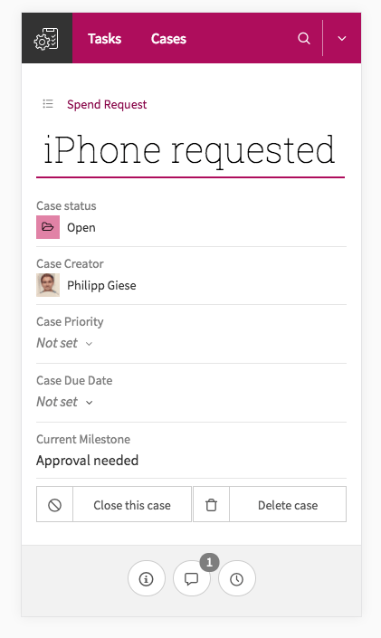
Designed with the goal of presenting an overview of a single case, the new case overview ensures key details like status, priority, due date, and case milestones are always on top:
The new link right above the case title takes you back to the cases overview page, showing all open and closed cases of a certain workflow (in this case, ‘Spend request’). This enables fast drill-downs and zoom-outs for a particular topic.
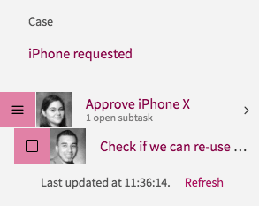
The new task overview leaves out sub-tasks, which can clutter your screen, but provides better detail whether or not a task was completed on time.
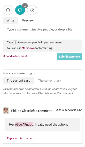
Comments and history can be shown on demand, helping you focus on the essentials. If one or more comments are made, the number of comments is indicated on the comment button, even if you don’t have the panel open, you know when you’ve received feedback or further information.
The new case view is also optimized to work perfectly on mobile devices, meaning you have full access to all information no matter whether you view it on a desktop, tablet, or smartphone.
The new task view
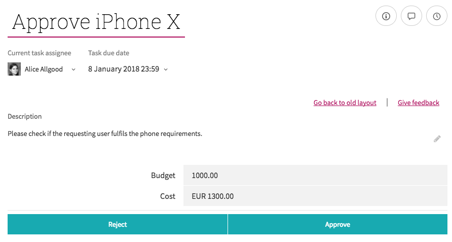
We removed everything that would distract you from completing a certain task, and re-designed this view from the ground up.
On the left side, the new task list gives you one-click access to all tasks within a case. This helps you figure out where in the process you are and who you could ask for assistance. Information from other tasks is also only one click away.
The task itself got way more real estate on the screen:
This way, forms are much easier to work with since they are the new star of the task view. We’ve also made assignments, due dates and candidates more prominent by giving them more space right underneath the task name.
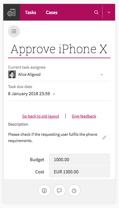
As with the new case view, the new task view is fully optimized to also work on your mobile phone. So no matter where you are, your tasks are always just a few clicks away!
Until next time...
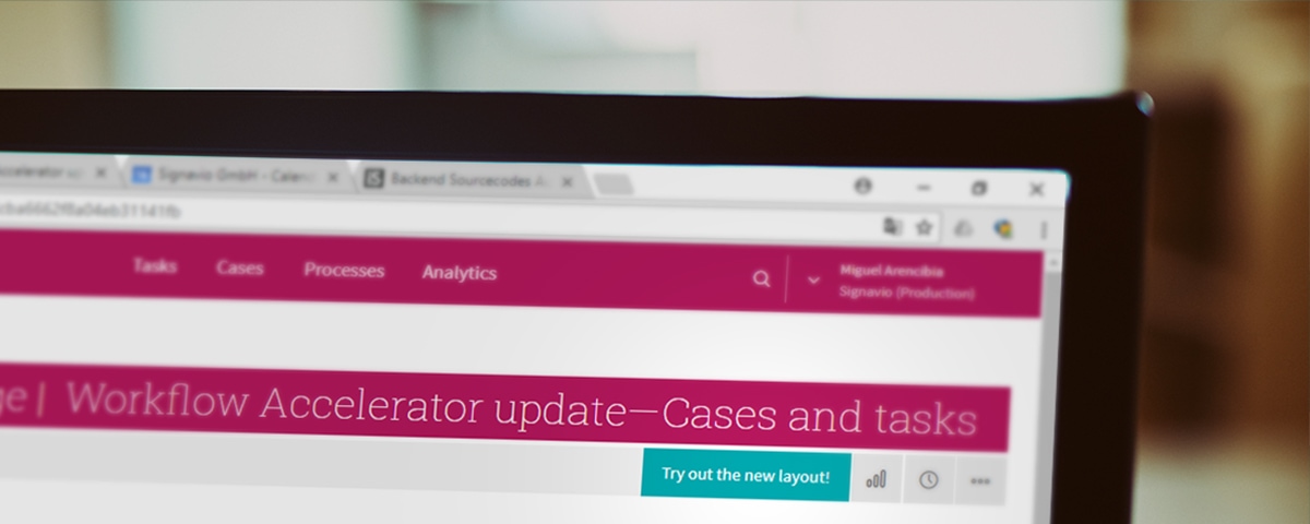
That’s it for this update. Next time you open Process Governance, just click 'Try out the new layout', as in the image below, and you can check out the new features. There’s also space to provide us with further feedback, so let us know what you think before the current layout is discontinued at at the end of February 2018.
Stay tuned for more information about upcoming features and improvements to the Signavio Process Transformation Suite by checking back here on the blog, or emailing us at info@signavio.com. Of course, if you’re ready to get started, you can sign up for a free Process Governance trial right away.

